Beyond Good Enough:
The Business Case for UX

I spearheaded the redesign of Seeking's Subscription / Purchase page, which increased non-membership revenue by 40% and first-time membership revenue by 23%.
My Role

Product Vision

Design Execution

Research

Strategy

Testing

Stakeholder Alignment

Tools Used
Sketch, Principle, UserTesting, Full Story, HotJar, Google Analytics, Jira, Confluence

Context

As a Principal UX Designer at Reflex Media, I noticed a troubling pattern: thousands of users were visiting our upgrade page, but fewer were completing the process. Since this page was central to revenue, I set out to understand the drop-off and make the case for a redesign.

The Issue

The upgrade page drew heavy traffic, but conversions lagged far below expectations. When I brought it up to leadership, they were skeptical and believed the page was "good enough". It technically worked, and the business was performing well. Some chalked it up to industry quirks, but I saw a missed revenue opportunity.

My Approach

I began with the data. Analytics revealed steep drop-off rates and conversion gaps compared to internal benchmarks and industry standards. At the same time, customer support and business development teams consistently shared feedback: users were confused about pricing tiers, struggled to find the right option, and frequently asked the same clarifying questions.

I started conducting usability tests on the original layout. After approximately 15 sessions, I noticed clear patterns in user behavior. Next, I hosted interviews with different user groups to understand their challenges better. I then reviewed recorded user sessions to identify issues that users might not know about.

After testing, three major areas were identified: 

Friction Points

1. Unclear package comparisons
2. Difficulty selecting the right option
3. Frustrating payment form errors

Solutions

Simplify tier comparisons and highlight the most popular plan
Reduce friction in the payment process
Form needs to be more intuitive
Building on the insights gathered, I developed a series of layout variations that explored different design directions and levels of complexity. The goal was twofold: first, to identify which layouts were best suited for testing with users to validate usability and engagement, and second, to evaluate which options would resonate most with leadership for strategic alignment. This structured approach allowed us to balance stakeholder priorities with evidence-based experimentation, ensuring we moved forward with designs that were both compelling and successful

Influencing Leadership

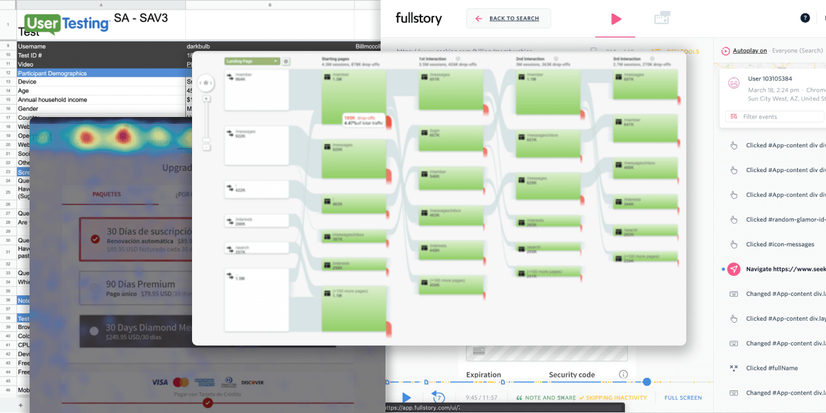
Instead of framing the work as "a design improvement," I positioned it as a revenue opportunity. I shared analytics clips, frustrated user sessions, and projections showing how a modest 5% conversion lift could translate into significant annual revenue. The turning point came when I walked leadership through an interactive prototype. Seeing a streamlined flow and clear calls to action made the opportunity tangible, shifting skepticism into buy-in.

What Got Shipped

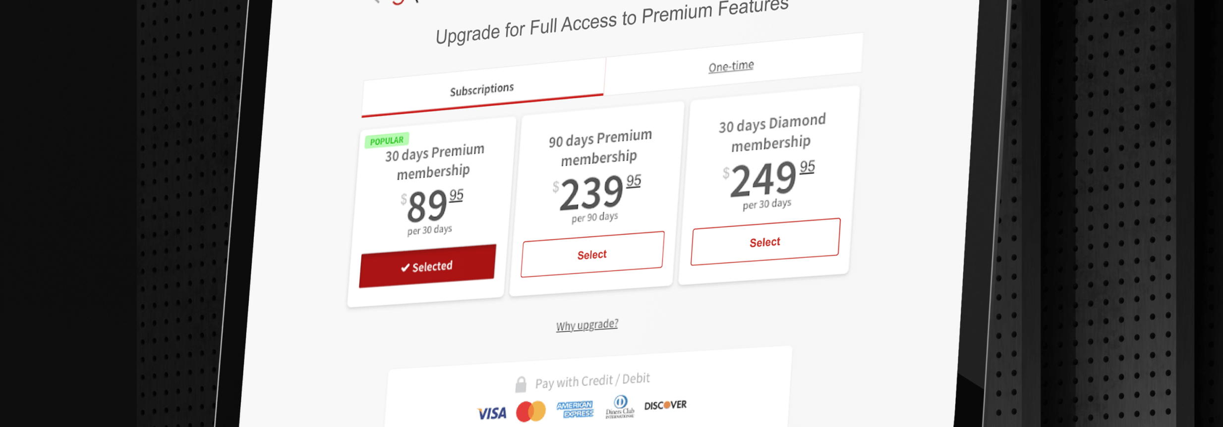
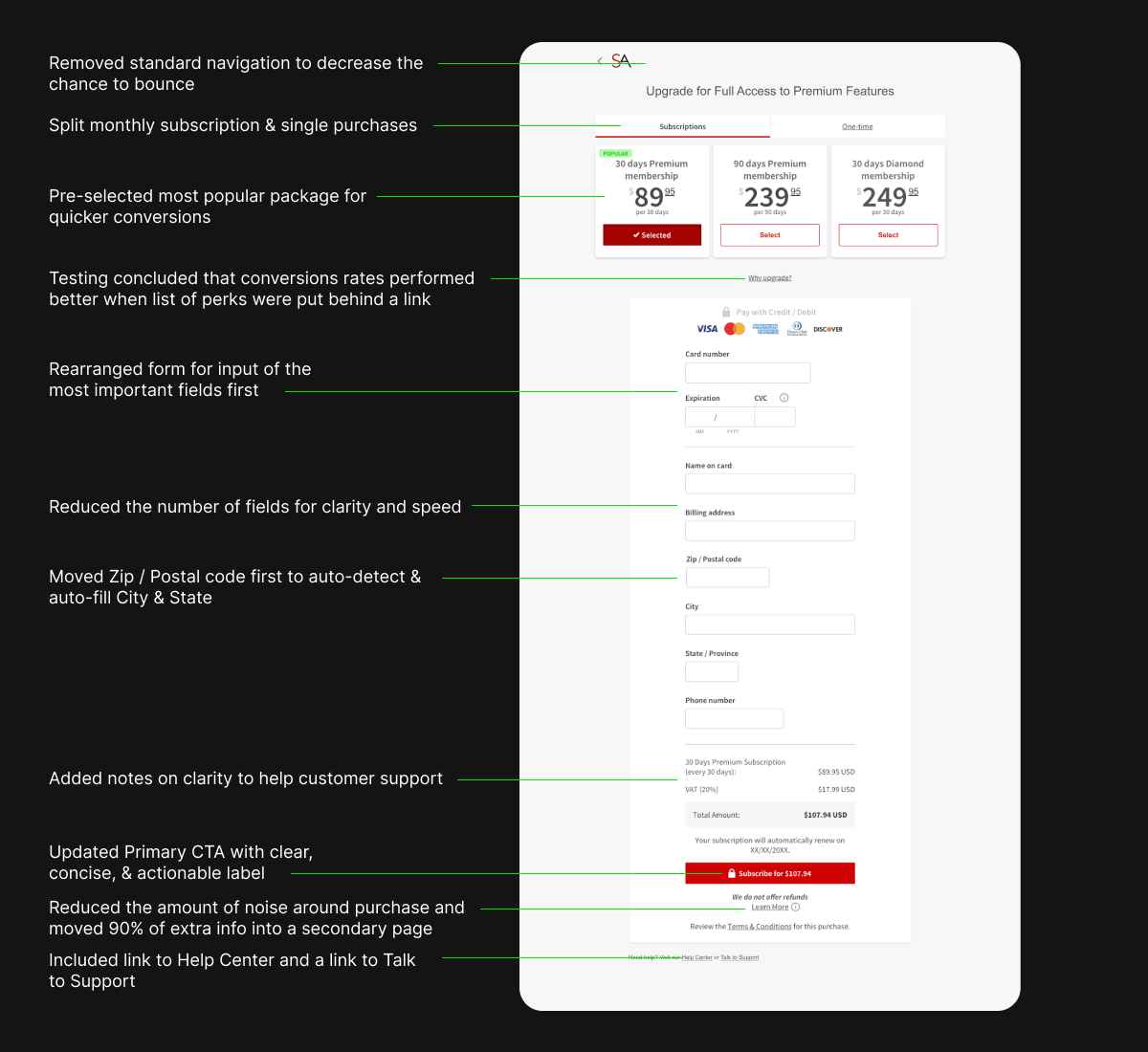
The redesigned upgrade page presented users with a clear, simplified choice. Each tier was easy to compare, with the differences surfacing at a glance. The most popular plan was highlighted to guide decision-making, while value messaging built trust. Instead of forcing users to parse complex tables or fine print, the page encouraged confident, quick decisions.

The Outcome

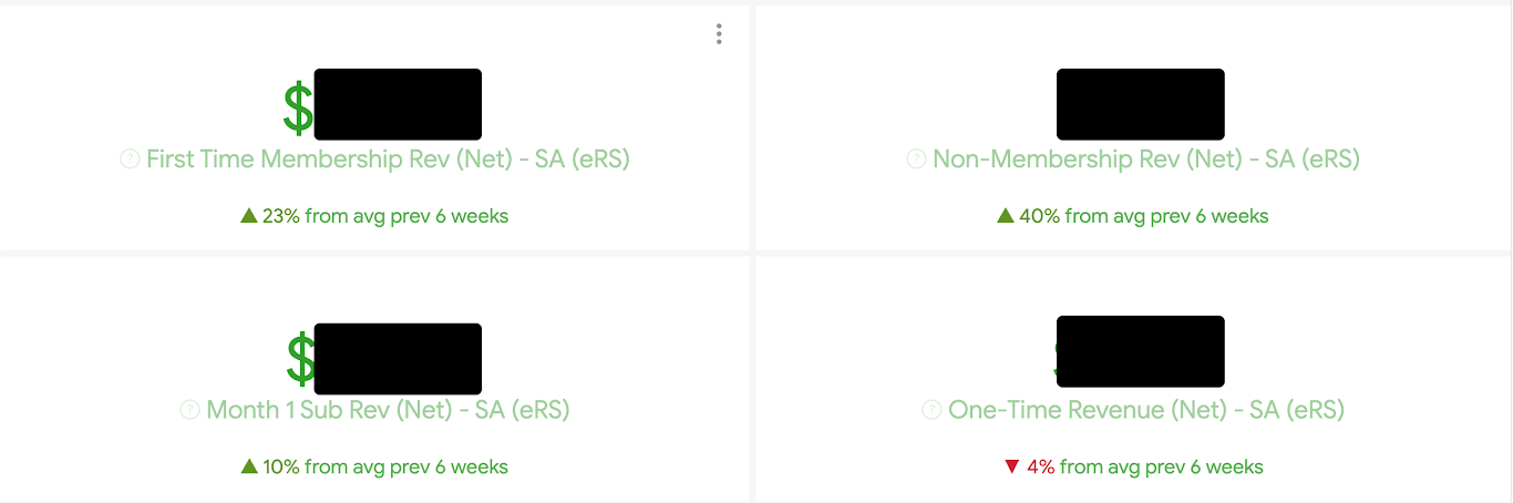
Once leadership approved the initiative and the redesigned page launched, the impact was clear:

+40%
Non-membership revenue
+23%
First-time membership revenue
  • Support inquiries about pricing and features decreased noticeably
  • Customers reported greater clarity and confidence in choosing a plan
  • Leadership began to see UX not just as a cost center but as a driver of revenue and growth

The project also set a precedent within the company. It showed how design could directly contribute to business outcomes when paired with data, customer insights, and persuasive storytelling.

Lessons Learned

This project showed me that design leadership is as much about influence as craft. Data opened the door, but pairing it with customer stories and a prototype made the case real. I learned that impact comes from connecting empathy with business strategy and proving that UX drives growth, not aesthetics.

  • Data opens the door, but empathy wins hearts. Analytics provided credibility, but the combination of customer stories and design vision secured buy-in.
  • Prototypes make opportunities real. An intuitive prototype was far more effective than slides full of numbers in shifting perspectives.
  • Influence is part of design leadership. As the Principal Designer, I created compelling experiences, influenced stakeholders, and aligned design with business strategy.